CSAT vs NPS vs CES: The Right IT Service Desk Metric (2026)
CSAT vs NPS vs CES compared for IT service desks: definitions, formulas, 2026 benchmarks, and why ticket-level NPS sets the strongest standard.

CSAT vs NPS vs CES: Which Satisfaction Metric Should Your IT Service Desk Use?
Your service desk resolves thousands of tickets a month, and your SLA dashboard says everything is fine. Yet somewhere between "resolved" and "reopened" sits the question every IT leader eventually asks: are our people actually satisfied with the support they receive, and which metric should we use to find out?
The short answer: the moment matters more than the metric. Satisfaction should be measured at the ticket level, while the experience is fresh, not through a quarterly survey. Of the three metrics, we believe NPS (Net Promoter Score), applied transactionally to every resolved ticket, sets the most demanding and revealing standard: its promoter-and-detractor logic exposes lukewarm and unhappy users that a 1-5 satisfaction rating lets hide. CSAT (Customer Satisfaction Score) remains a useful, familiar percentage view, and CES (Customer Effort Score) is strongest for exposing friction in self-service portals and request processes.
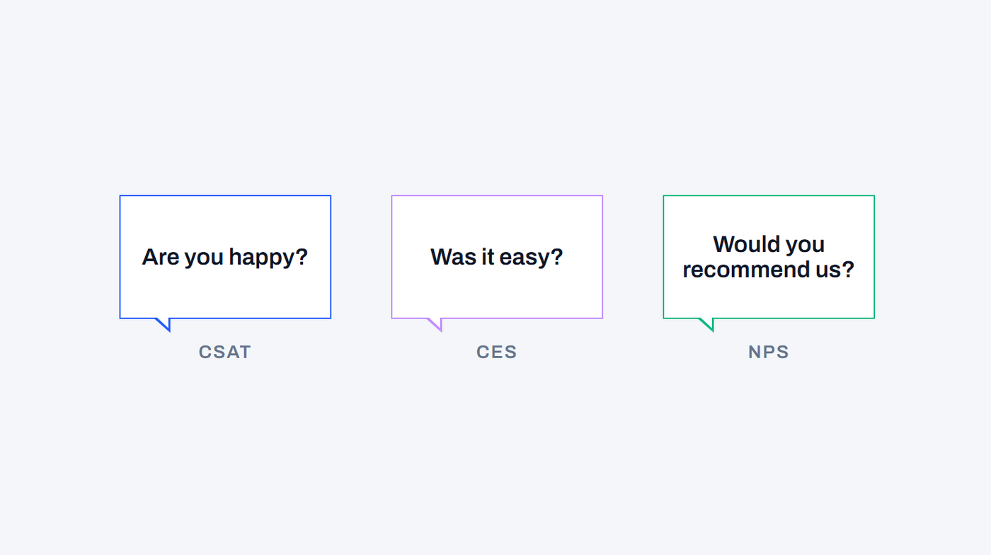
The three metrics answer three different questions (Are you happy? Was it easy? Would you recommend us?), and applying the wrong one to the wrong moment produces data you can't act on. It's also how service desks end up with green SLA reports and frustrated users at the same time.
This guide breaks down each metric's definition, formula and ideal use case, compares all three across common IT scenarios, and shows current benchmarks.
CSAT vs NPS vs CES: What's the Difference?
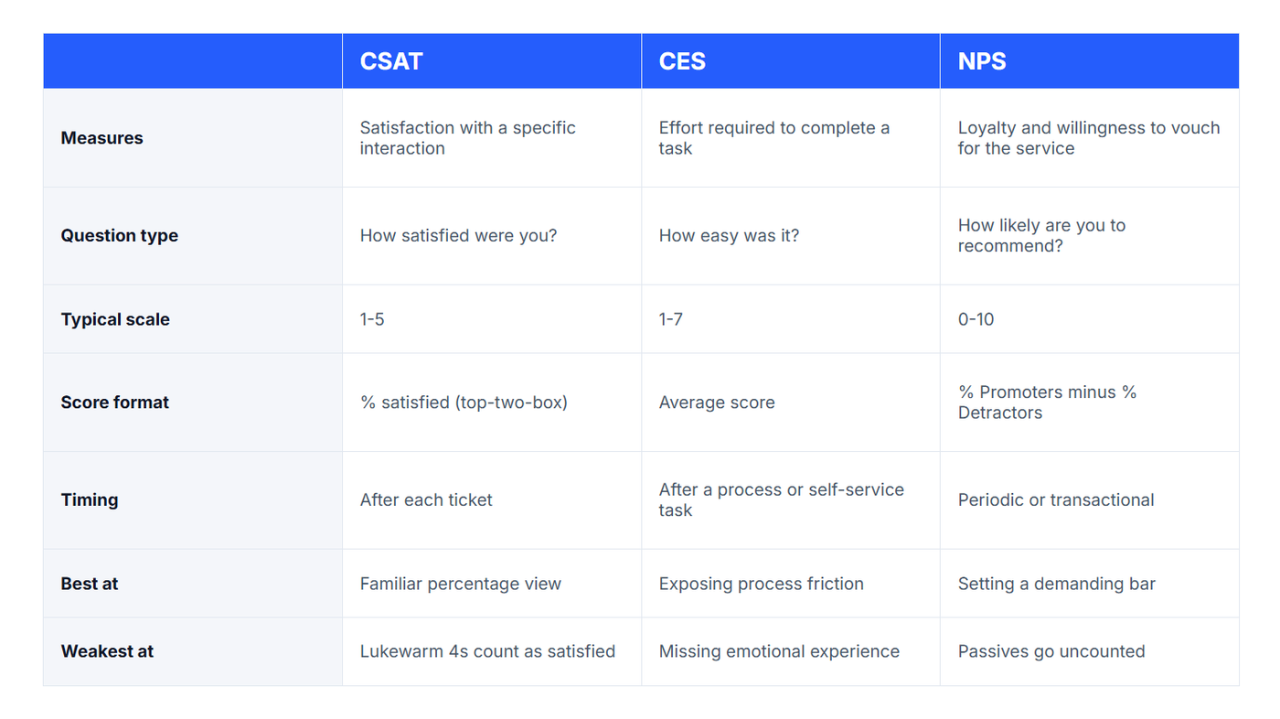
The three metrics are easy to confuse because all three arrive as a short survey and produce a number. The difference is the question each one answers: CSAT asks "Are you happy?", CES asks "Was it easy?", and NPS asks "Would you recommend us?" In short: a snapshot, a process check and a loyalty test. Here's the short version, with a deep dive on each metric below.
What Is a CSAT Score?
A CSAT score (Customer Satisfaction Score) measures how satisfied someone is with a specific interaction, product or service, expressed as the percentage of respondents who gave a positive rating. For an IT service desk, that usually means a one-question survey sent when a ticket is resolved: satisfied responses divided by total responses, multiplied by 100.
The survey question. CSAT surveys ask a direct question tied to the interaction that just happened, such as "How satisfied were you with how your recent IT support request was handled?" Users answer on a rating scale, most commonly 1-5, though 1-10, star and emoji scales are all in use. Whichever scale you choose, consistency matters more than the format itself: switching scales mid-year invalidates your trend line.
The formula. CSAT is calculated using the "top-two-box" method, where only the two highest ratings count as satisfied:
CSAT % = (number of satisfied responses ÷ total responses) × 100
On a 1-5 scale, that means counting only the 4s and 5s. If your service desk closes the month with 850 survey responses and 714 of them rated the experience a 4 or 5, your CSAT is (714 ÷ 850) × 100 = 84%. Neutral 3s don't count in your favour.
One caveat when comparing scores. A survey-based CSAT percentage is not the same as an index score like the American Customer Satisfaction Index, which weights multiple questions into a 0-100 figure (the ACSI's US national score stood at 76.9 in Q4 2025). Before benchmarking against any published number, confirm it was calculated the same way as yours.
Where CSAT fits. Its strengths are familiarity and readability: a percentage every stakeholder understands at a glance, attached to a real ticket and a real moment. Benchmarking firm MetricNet identifies first contact resolution as the single biggest driver of customer satisfaction in IT support, and per-ticket measurement is how that relationship becomes visible. CSAT's limitation is its generosity: because a 4 and a 5 count identically, a desk full of merely tolerable experiences can post the same score as a desk people genuinely rate highly. It also captures a moment, not loyalty, and a score without an open-text "why" tells you something is wrong without telling you what.
What Is NPS (Net Promoter Score)?
NPS (Net Promoter Score) measures loyalty rather than momentary satisfaction: whether someone would put their own name behind recommending your service. Created by Fred Reichheld of Bain & Company in 2003, it asks one standard question on a 0-10 scale and produces a single score between −100 and +100.
The survey question. The wording is famously fixed: "On a scale of 0 to 10, how likely are you to recommend [our IT service desk] to a friend or colleague?" Respondents fall into three bands: Promoters (9-10), Passives (7-8) and Detractors (0-6).
The formula. Passives are excluded entirely; the score is the gap between your enthusiasts and your critics:
NPS = % Promoters − % Detractors
If 500 employees respond to your IT survey and 45% score 9-10 while 20% score 0-6, your NPS is 45 − 20 = +25. Note how demanding the maths is: a 7 out of 10, a decent rating by most instincts, contributes nothing, and a 6 actively counts against you. That severity is the point. Where CSAT's top-two-box lets lukewarm ratings pass as success, NPS refuses to count anyone who isn't genuinely won over, and it names the group you most need to hear from: detractors. We believe that makes it a better measure than any 1-5 rating: it separates "no complaints" from "actually impressed", and those are very different service desks.
Two ways to run it. NPS comes in two modes. Run relationally (a periodic, organisation-wide survey), it gauges the overall IT–business relationship. Run transactionally (triggered by each resolved ticket), the same demanding standard becomes a per-ticket, per-agent, per-team signal; a full section on that below, because the transactional form is where NPS earns its place on the service desk.
What to watch when using NPS internally. Anchor the wording to something colleagues genuinely do: people may not "choose" their service desk, but they absolutely do recommend, or warn each other about, contacting it, so phrasing like "Based on this experience, how likely are you to recommend our IT service desk to a colleague?" reflects real behaviour. And remember that an occasional blanket survey can't isolate a specific ticket or agent; that granularity comes from running it transactionally.
What Is CES (Customer Effort Score)?
CES (Customer Effort Score) measures how much effort someone had to expend to get an issue resolved or a task completed. It was introduced in 2010 by CEB (now Gartner) in the Harvard Business Review article "Stop Trying to Delight Your Customers", which argued that reducing effort does more for loyalty than exceeding expectations.
The survey question. The standard modern format (often called CES 2.0) is an agreement statement rather than a question: "The IT team made it easy for me to get my issue resolved", answered on a 1-7 scale from Strongly Disagree to Strongly Agree. A simpler variant asks directly: "How easy was it to get your issue resolved today?"
The formula. Unlike CSAT's percentage, CES is typically reported as an average:
CES = sum of all response scores ÷ number of responses
If 200 users respond to a portal survey and the scores add up to 1,140, your CES is 1,140 ÷ 200 = 5.7 out of 7. Some teams instead report the percentage of "easy" responses (6s and 7s). Either works, but pick one and stay consistent, because scale and directionality vary between tools and mixing them destroys your trend data.
Why effort matters. The research behind CES is striking: in CEB/Gartner's original studies, 96% of customers who had high-effort experiences became more disloyal, compared with just 9% of those whose experience was low-effort. Later Gartner research found 94% of customers reporting low-effort interactions intended to repurchase, against 4% of those reporting high effort.
Measuring CES in an IT context. For IT teams the deployment logic differs by touchpoint. CES belongs where process friction lives: the self-service portal, software requests, new-starter provisioning, access approvals. A user might rate the agent who eventually helped them highly after being bounced between three teams to get there (terrible CES). That gap between the scores is often where your process problems are hiding.
Which Metric for Which IT Scenario?
Now that the three metrics are clear, here's how to choose. In practice the choice maps cleanly to the moment you're measuring:
- A ticket was just resolved → transactional NPS. Triggered per ticket, it ties the score to that incident, that agent, that team (the granularity coaching and service recovery depend on) while holding responses to a harder standard than a satisfaction rating. A CSAT question works here too, and many desks report both; our view is that NPS's stricter scoring makes it the better primary signal.
- A user finished a self-service or request process (password reset portal, software request, onboarding) → CES. Effort is the signal that predicts whether they'll bother using self-service again.
- You want the organisation's overall verdict on IT → relational NPS, run as a periodic pulse across the whole business, not attached to any single ticket.
- You can only run one metric → transactional NPS. For a service desk, the ticket is the atomic unit of work, so whatever you measure must attach to it. Run at the ticket level, NPS gives you the per-ticket signal and the demanding standard in one question.
The metrics are complements, not rivals. The most common failure mode isn't choosing the "wrong" metric; it's using one metric for a job it was never designed to do, like running a quarterly blanket survey and expecting it to tell you which agents need coaching.
How to Measure Transactional NPS
Transactional NPS (tNPS) applies the standard NPS question to a single, specific interaction, such as a just-resolved ticket, rather than to the overall relationship. The formula is unchanged (% Promoters − % Detractors); what changes is the trigger, the timing and the framing of the question.
Transactional vs relational NPS. Relational NPS is the classic form: sent periodically (quarterly, half-yearly or annually) to a broad sample, independent of any recent interaction, asking about the relationship as a whole. Transactional NPS is event-triggered: it fires after a defined touchpoint and anchors the question to it: "Based on this support experience, how likely are you to recommend our IT service desk to a colleague?" One measures the reservoir of goodwill; the other measures the splash each interaction makes in it.
Measuring it properly comes down to five rules:
- Trigger on the event, immediately. Send the survey at ticket resolution or within 24 hours, while the experience is fresh; delayed surveys measure memory, not experience.
- Anchor the wording to the interaction. Use phrasing like "Based on this experience…"; otherwise respondents answer about IT in general and you've accidentally run a relational survey.
- Keep it to one question plus an open-text "why." The comment field is where the diagnostic value lives.
- Segment by touchpoint. Score incidents, service requests and onboarding separately; a blended tNPS across different interaction types hides more than it reveals.
- Never merge tNPS with relational NPS. They answer different questions on different timelines. Report them side by side, not averaged.
Why this is the model we back. Run this way, transactional NPS combines the two things a service desk metric must do: attach to the ticket (so every score has an owner, a team and a timestamp) and hold a demanding line (so the number can't be flattered by lukewarm ratings). It comes with detractor identification built in, which is what makes same-day service recovery possible: a 0-6 lands and someone follows up, often before the user has logged off. And because the 0-10 scale never changes, your trend line survives tooling and process changes.
CSAT and NPS Benchmarks: What's a Good Score?
For an IT service desk, a CSAT between 75% and 85% is solidly good, with 85%+ marking a top-performing desk. For NPS, Bain & Company's own interpretation bands apply: above 0 is positive, above 20 favourable, above 50 excellent and above 80 world class. CES has no reliable published benchmark, because scales and directionality vary too much between implementations, so it's best judged against your own trend line.
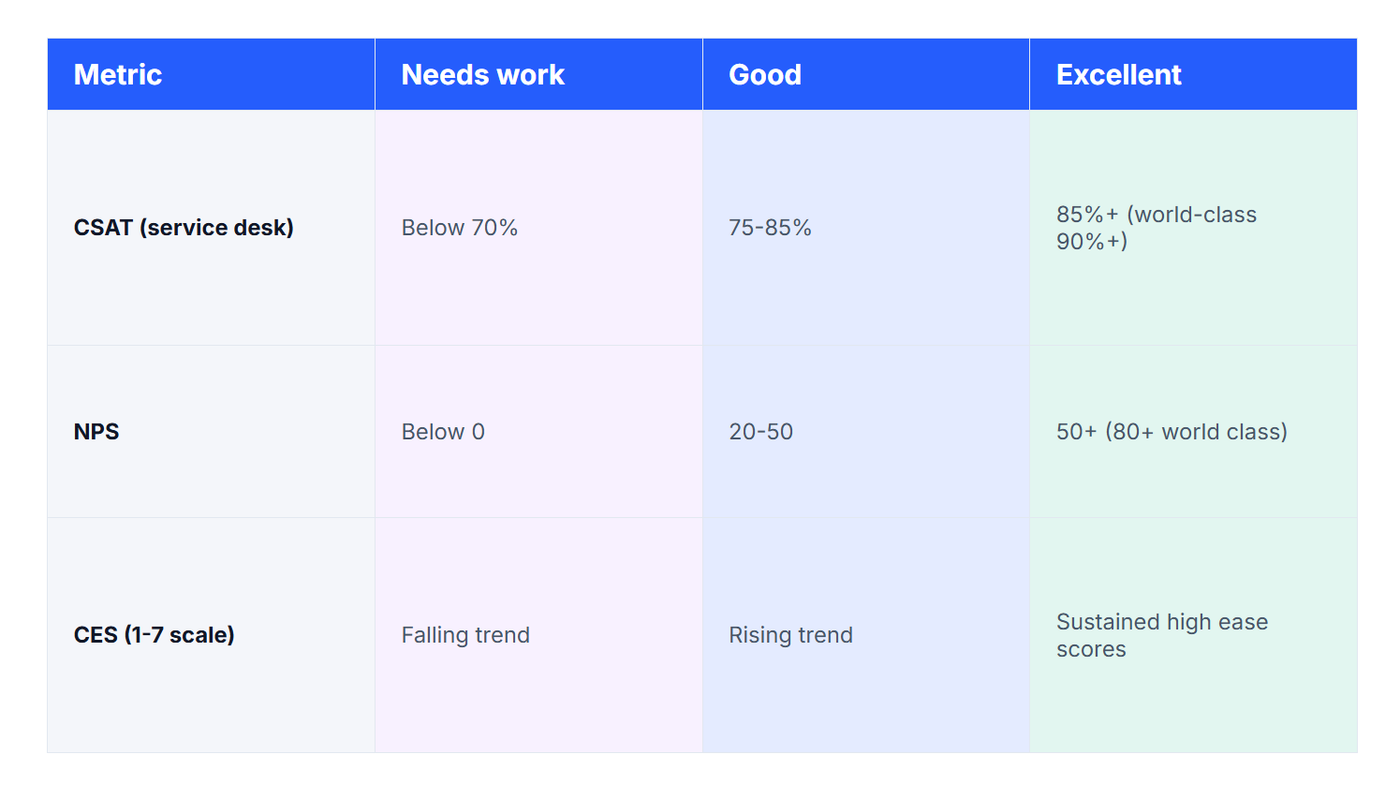
Context for IT specifically. Benchmarking firm MetricNet, which has audited service desk performance for decades, frames it plainly: a desk above 90% customer satisfaction is performing very well indeed, while one hovering around 70% has a problem worth investigating. For wider perspective, the American Customer Satisfaction Index, the economy-wide barometer, stood at 76.9 out of 100 in Q4 2025, essentially flat since 2017. Remember from earlier that ACSI is a weighted index, not a survey percentage, so treat it as context rather than a direct comparison.
A caution on "NPS and CSAT benchmarks by industry" tables. Most published by-industry benchmark tables are compiled by survey vendors from their own customer bases, with methodologies that differ enough (transactional vs relational sampling, scale choices, top-two-box definitions) to make cross-table comparison shaky. Two patterns are consistent across sources, though: B2B and technology sectors score systematically lower on NPS than consumer sectors, and internal IT functions face a harder crowd than customer-facing teams, because respondents didn't choose their provider. Benchmark transactional and relational NPS separately, too; they sit at different levels.
The benchmark that matters most is your own. External figures tell you roughly where the goalposts stand; your month-on-month trend, segmented by team and ticket type, tells you whether you're improving. A desk that moves from +18 to +34 in six months is a better story than a desk sitting statically at +40.
Beyond the Score: SLAs, XLAs and the Green Watermelon
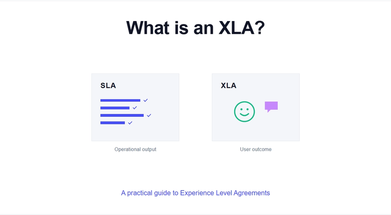
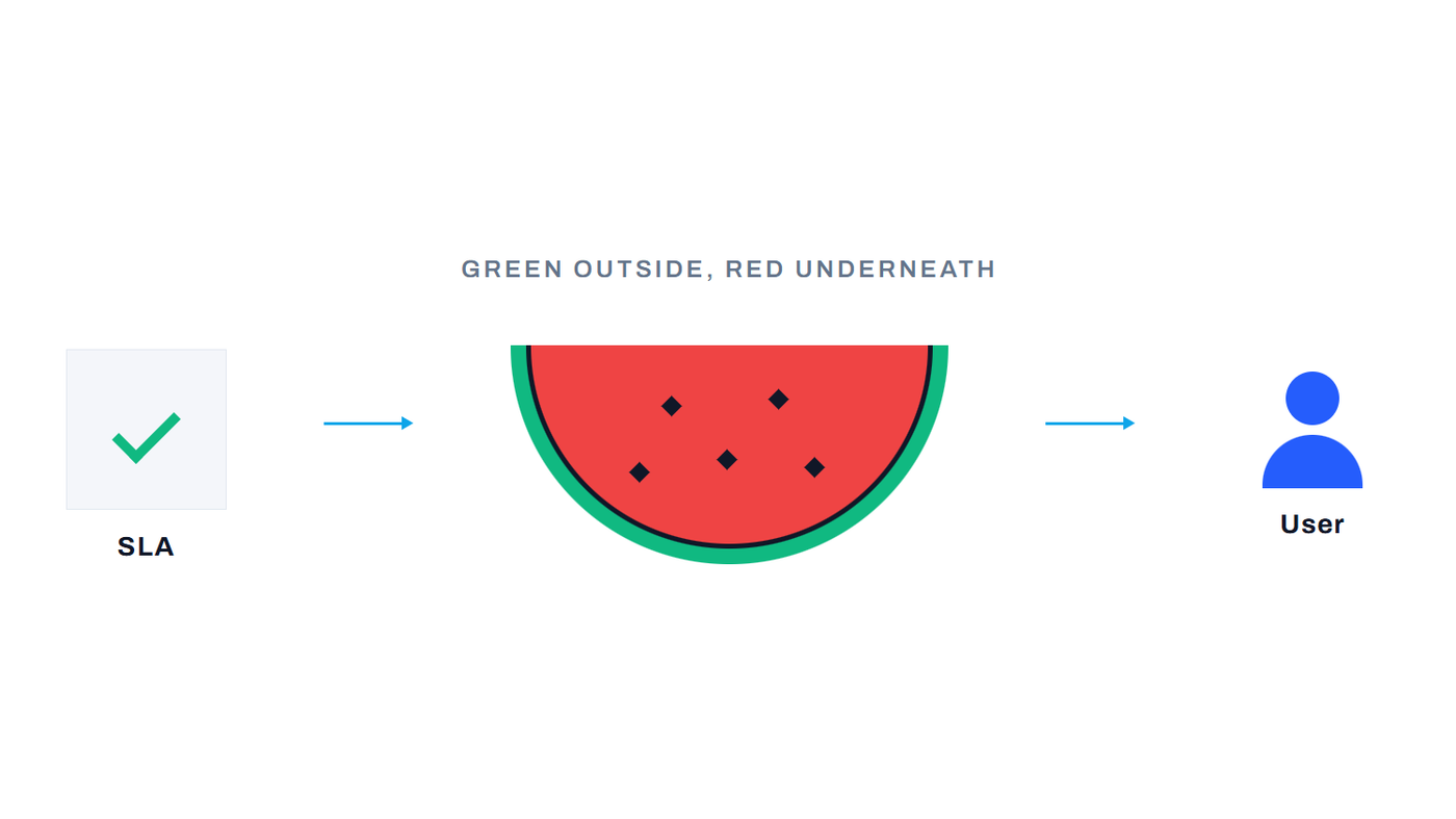
A satisfaction metric only matters if it changes what your dashboards can see. Most service desks already measure plenty (response times, resolution times, uptime) and hit their targets. That's exactly what makes the industry's favourite fruit metaphor sting: the watermelon effect, where every SLA on the dashboard glows green while, underneath, users are red with frustration. The tickets closed on time; the experience was still poor.
This gap is why the ITSM industry has been shifting from SLAs towards XLAs, or Experience Level Agreements. The term, coined by Amsterdam consultancy Giarte, describes targets set on outcomes users feel rather than outputs IT produces: not "95% of P2 incidents resolved within eight hours" but "sustain a ticket-level NPS above +40." An SLA proves the machine ran; an XLA asks whether anyone was happy with what it produced.
Here's where the three metrics reconnect: an XLA is only as good as the experience data feeding it, and that data is precisely what per-ticket NPS, CES and CSAT provide. A per-ticket experience programme is, in effect, the measurement engine an XLA strategy runs on: continuous, tied to real incidents, agents and teams, and impossible to game the way an SLA clock can be.
This is the problem ciopulse was purpose-built for. When a ticket is resolved in your ITSM platform, whether ServiceNow, Jira Service Management, Zendesk or any other, your ITSM sends the user a short ciopulse survey, and every score lands attributed to its incident, agent and team, in real time, with detractor responses surfacing in a daily Service Recovery digest.
The result is the independent experience layer your SLA dashboard is missing: the data that tells you whether the watermelon is green all the way through. If the watermelon problem sounds familiar, we've unpacked how it happens, and how to expose it, in our guide to the watermelon effect in IT service.
Frequently Asked Questions
Is CSAT better than NPS for an IT service desk?
Both can be measured at the ticket level, and either beats a periodic survey. Our view: NPS applied transactionally is the stronger standard, because its scoring is more demanding (a lukewarm 7 counts for nothing) and it flags detractors for immediate follow-up. What matters most is measuring every ticket, not once a quarter.
What is a good CSAT score for IT support?
Between 75% and 85% is good for a service desk; 85%+ is excellent, and world-class desks push past 90%. Anything hovering around 70% or below signals a problem worth investigating.
Can you use CSAT, NPS and CES together?
Yes, they're complements. A strong pattern: transactional NPS on every resolved ticket, CES on self-service and request processes, and a monthly customer satisfaction report built on NPS for teams who want a familiar summary view.
What's the difference between transactional and relational NPS?
Transactional NPS fires after a specific interaction, such as a resolved ticket, and anchors the question to it; relational NPS is sent periodically about the relationship as a whole. Report them separately and never average the two.
How do satisfaction metrics relate to XLAs?
An XLA (Experience Level Agreement) sets targets on user experience rather than operational outputs. Per-ticket NPS, CES and CSAT supply the continuous experience data an XLA is measured against.
Ready to see the metric in action? ciopulse turns every resolved ticket into a real-time, ticket-level experience signal, attributed to the incident, agent and team, on any ITSM platform. See how ciopulse works.
See ciopulse in action
Real-time IT satisfaction feedback that integrates with any ITSM platform. Book a 15-minute demo and see how it works.
BOOK A DEMO